
AI-Assisted Copy in Website Creation
— CASE STUDY: MARKETING 360 WEBSITES
Designing an inline AI text generation experience that meets writers exactly where they work and without interrupting the creative flow that was already there.
Role
Product Designer (Remote)
Product
Marketing 360 Websites
Scope
Website builder + Blog CMS
Timeline
Rapid Delivery
Status
Live
Overview
Words are the hardest part of building a website.
For small business owners, the blank page isn't just intimidating — it's a business blocker. They know what they do, they know who they serve, but translating that into compelling website copy, blog posts, and hero headlines is a skill most of them don't have time to develop.
Meanwhile, Canva, Wix, and Squarespace were shipping AI writing tools. Our users were noticing. The gap had to close quickly but seamlessly. It had to feel native to how they already worked.
The answer wasn't a separate AI writing tool. It was bringing AI to the exact moment users needed it: cursor in the text block, staring at empty space, wondering what to say.
Design Constraint
Don't interrupt the flow to offer AI assistance. Put it where the writer already is: in the toolbar, in the field, zero steps away from the work.
Problem
The blank page, a content creator’s lament.
Marketing 360's website creator tool serves tens of thousands of small businesses. From plumbers, florists, landscapers, consultants, each of these SMBs who choose a DIY plan, are tasked with building their own web presence without a marketing team. For most of them, writing compelling copy is the single biggest point of friction in the product.
BEFORE:
The copy writing gap
Users abandoned text blocks with placeholder copy still showing
Generic, low-effort copy shipped to live sites, hurting conversion
No way to quickly rewrite, simplify, or expand existing text
Blog content creation was slow — no starting point, no assistance
Competitor tools actively marketing AI writing to the same audience
AFTER:
The opportunity
Generate copy inline, without leaving the text block or changing context
Quick actions — Simplify, Shorten, Lengthen — for existing copy
Free-form prompt for custom rewrites and tonal adjustments
Multiple suggestions surfaced at once for choice and comparison
Same capability extended to the blog CMS for content workflows
"I just need someone to tell me what to write. I know my business. I just don't know how to say it."
— RECURRING SENTIMENT, VARIOUS USER INTERVIEWS
Approach
Designing a seamless entry point for maximum discoverability.
The design challenge was deceptively simple to describe and genuinely hard to execute well: make AI text generation feel like it was always meant to be there. Not a feature. Not a modal. Not a separate mode. Just a natural extension of the writing toolbar users already used every day.
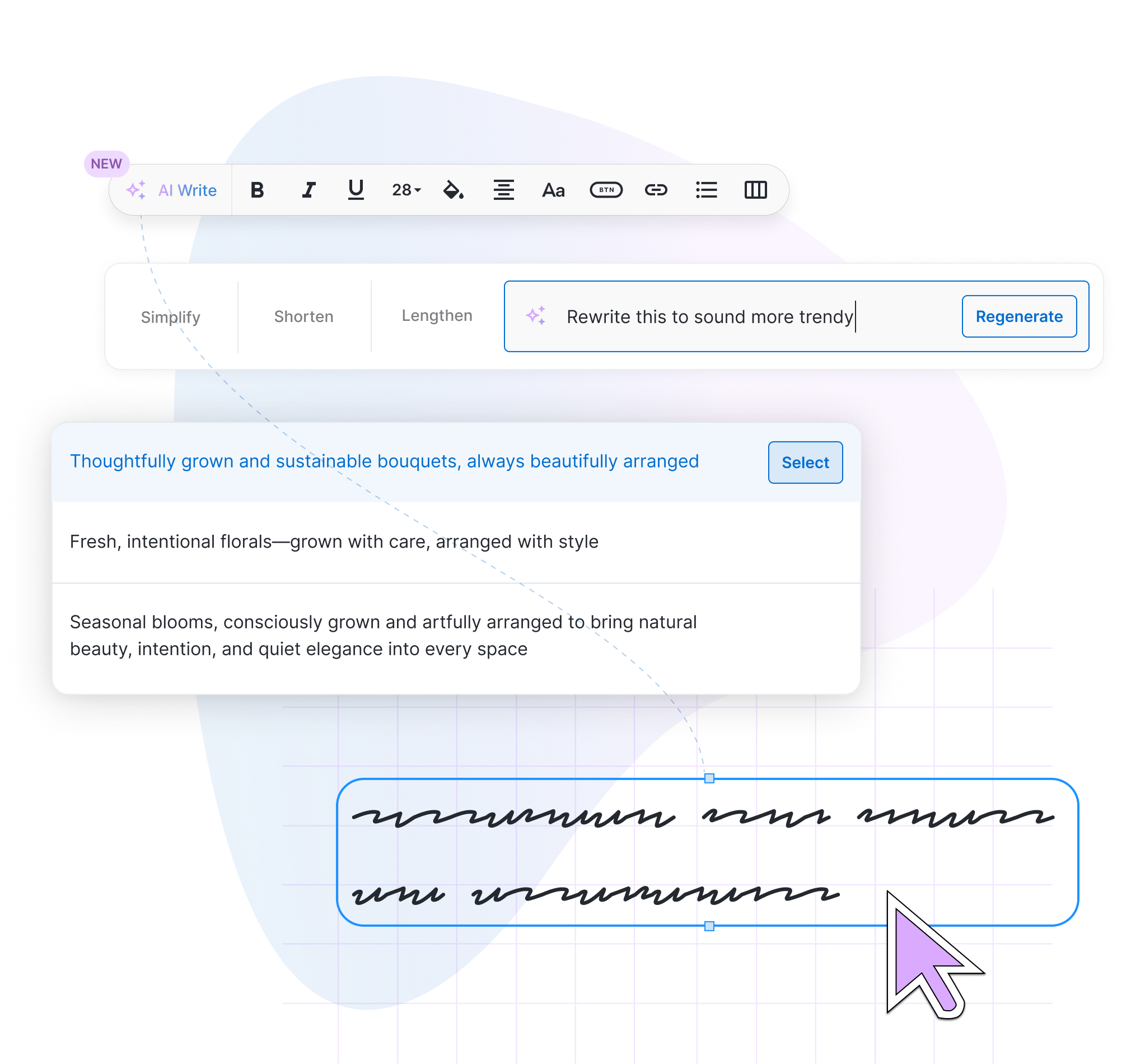
The entry point, a sparkle icon in the rich text toolbar, became the entire system's anchor. Consistent across both surfaces. Familiar enough to feel safe. Novel enough to signal something new.
01
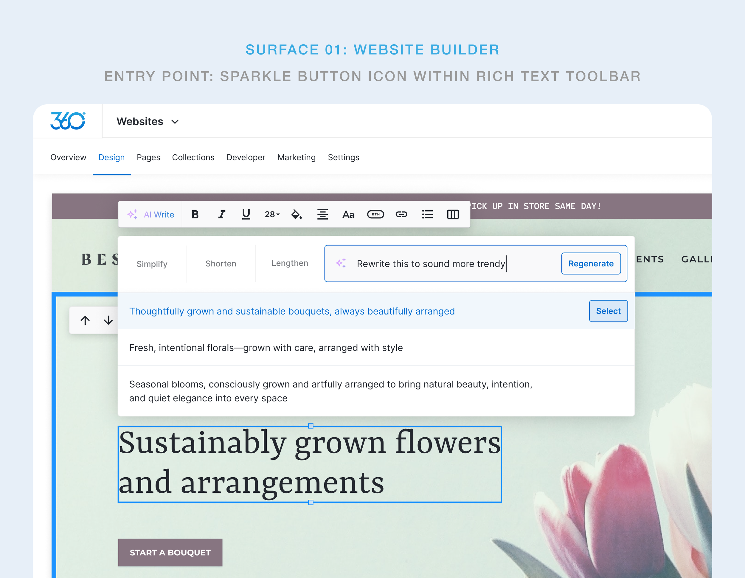
Website builder
Activated from the floating text toolbar that appears when a text block is selected on the live canvas. The AI input bar drops inline, below the toolbar, directly above the content being edited.
02
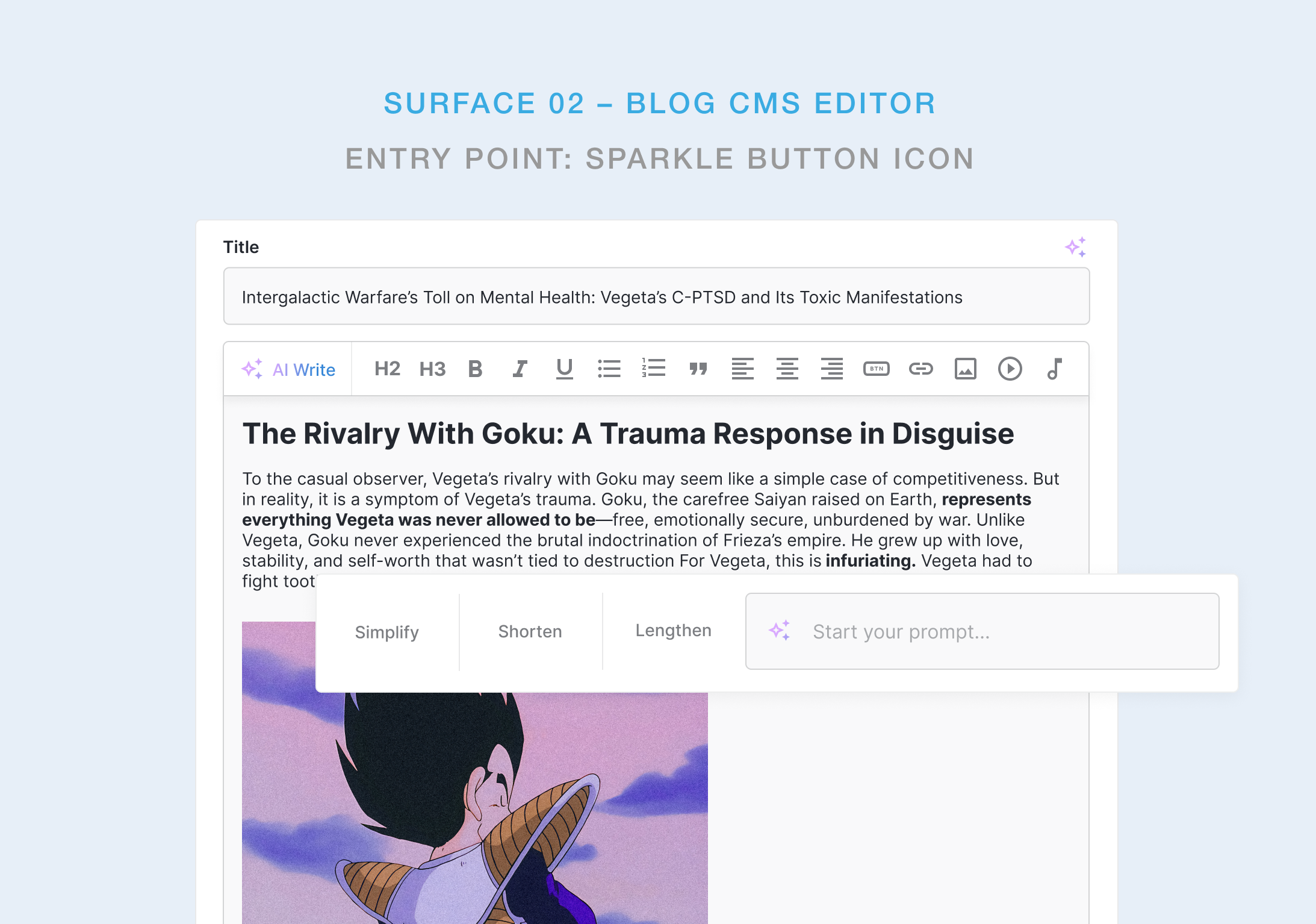
Blog CMS editor
Activated from the sparkle icon within various input fields and in the rich text editor toolbar. Same interaction pattern, different context: backend content workflows rather than live canvas editing.
Key Design Decision
The quick-action buttons — Simplify, Shorten, Lengthen — were designed for users who already had copy but wanted to improve it. They execute with a single click, no prompt required. The free-form input field exists for everything else. This two-speed system serves both the confident editor and the beginner without making either of them feel catered to at the expense of the other.
GENERATION EXPERIENCE
Write, refine, or start from nothing
The AI writing experience was designed around a single truth: users don't always know what they want until they see options. That meant the system needed to surface multiple suggestions simultaneously, not one at a time, so users could compare, choose, and feel in control rather than dependent.
PROCESS
Competitive pressure as a design constraint
This was a rapid design sprint, not a discovery project. The product decision was already made by stakeholders. The market had spoken and we needed to respond. The design challenge was making a fast-follow feature feel like it was designed for our product specifically, not copied from somewhere else.
01
Competitive audit
Reviewed Canva Docs, Wix AI Text Creator, and Squarespace's AI writing tools to identify UX patterns users were already being trained on.
02
UX mapping
Identified the two primary writing surfaces — website canvas and blog CMS — and mapped the interaction model that could work consistently across both.
03
Entry point design
Explored multiple approaches to triggering the AI experience. Settled on the toolbar sparkle icon as the most natural and discoverable position for both surfaces.
04
Interaction design
Designed the inline input bar with quick actions and free-form prompt in Figma. Focused on minimising the gap between trigger and generation to a single step.
05
Internal Testing
Rapid internal sessions to validate discoverability of the sparkle icon, clarity of the quick-action labels, and perceived quality of suggestions.
06
Ship + obeserve
Delivered to production with a plan for post-launch iteration as real usage data surfaced. Built to extend — more tones, more actions, better context awareness.
Using internal testing rather than external research was a deliberate tradeoff. This let us validate the core interaction quickly while maintaining pace. We were honest about what this meant: we were validating usability, not desirability. Post-launch data would tell us the rest.
KEY FINDINGS
Insights gained while designing this AI writing tool
01
Placement is the feature
With AI writing tools, where the feature lives matters more than what it does. The sparkle in the toolbar isn't a button — it's a promise that help is always one click away, exactly where the user is already focused. Context proximity is the real UX innovation.
02
Multiple outputs shift the power dynamic
Showing three suggestions instead of one fundamentally changes how users feel about AI. One output feels like a verdict. Three feel like options. The second framing keeps the human in control and makes the AI feel like a collaborator rather than a replacement.
03
Quick actions carry the volume
In testing, users reached for Simplify, Shorten, and Lengthen far more than the free-form prompt. Most people know what's wrong with their copy and they just need a fast way to fix it. Design for that majority first; the power-prompter is the secondary use case.
04
Preserve the original, always.
Never replacing a user's existing copy until they explicitly choose through a “Select” call-to-action” was the most important design decision at the final step of the user flow. It made the feature feel safe to try. Without that safety, exploration dies before it starts, especially for users who worked hard on their original copy.
OUTCOMES
Shipped, adopted, and built to scale & grow.
The architecture is deliberately open. Planned extensions include brand voice awareness (generating copy that matches the business's existing tone), industry-specific suggestions seeded from the user's business category, and a tone selector that lets users dial between formal, casual, and promotional without writing custom prompts. The hardest part was getting users to trust and reach for AI assistance in their writing workflow, but our post-launch findings show that work is already done and this feature is now a workflow-staple.
PRODUCT:
Parity achieved
AI writing, now live across both the website builder and blog CMS, matches core capability of Canva, Wix, and Squarespace offerings.
UX:
Zero-disruption integration
No new modal. No new page. No new workflow to learn. The feature lives entirely within interactions users already performed daily.
DESIGN:
Foundation for iteration
The feature is designed to absorb future capabilities such as presets, brand voice settings, without structural changes.
KPIs & performance
By embedding AI generation directly into an existing workflow, the feature drove immediate adoption with zero onboarding friction. Users found it, used it, and came back to it. Mission accomplished.
COPYWRITING TIME
saved per page on average was
60%
BUSINESS IMPACT
Content velocity of posts increased
3x
FEATURE ADOPTION
within 14 days of launch
70%
USER SATISFACTION
of internal testers rated the UX intuitive