
— CASE STUDY: MARKETING 360 WEBSITES
Rapid Delivery:AI Image Generation
for Websites
Designing a zero-friction AI image generation experience from a single dropdown item to a production-ready modal — shipped fast to stay competitive.
Role
Product Designer (Remote)
Product
Marketing 360 Websites
Responsibilities
Internal Testing
UX & UI Design
Timeline
Rapid Delivery
Q4
Status
Live
Overview
The market wasn’t waiting, neither we’re we.
Canva had it. Wix had it. AI image generation inside creative tools had gone from nice-to-have to table stakes almost overnight — and our users were noticing the gap.
The challenge wasn't whether to build it. The challenge was how to introduce a genuinely powerful AI capability without disrupting a workflow that thousands of small business owners relied on every day to publish their sites.
The existing image uploader was a simple component with file upload and image library access. It was familiar, trusted, and low friction. An AI feature had to earn its place inside that interaction, not derail it.
Design Constraint
The feature needed to feel like a natural extension of a component users already understood and not an AI-first experience grafted on from the outside.
Problem
A missing capability that was quickly becoming a competitive liability
Our Websites product serves small business owners building and managing their own web presence. For many of them, finding and sourcing the right imagery is one of the most time-consuming, frustrating parts of website creation. They're not designers, stock photos feel generic, Unsplash isn’t limitless, and hiring photographers isn't in budget.
BEFORE:
The image sourcing problem
Users left the platform to find images on Google or stock sites
Upload friction when images were wrong size, format, or resolution
Image library was limited — not always relevant to the user's industry
No ability to generate something bespoke to their brand or content
Competitor tools were shipping AI image generation, creating visible gaps
AFTER:
The opportunity
Generate a relevant featured image without leaving the editor
Prompt-driven: users describe what they want in plain language
Multiple aspect ratios supported — landscape, portrait, square
Regenerate freely until satisfied, then apply in one click
Designed to slot into existing uploader UI with zero relearning
"Why can't I just describe what I want and have it appear?"
— RECURRING SENTIMENT
Approach
Micro entry point. Mega experience.
The design challenge I was faced with solving had two distinct layers: the entry point and the experience. And getting both right was essential. A powerful modal that nobody could find would fail. A visible shortcut leading to a disappointing experience would too.
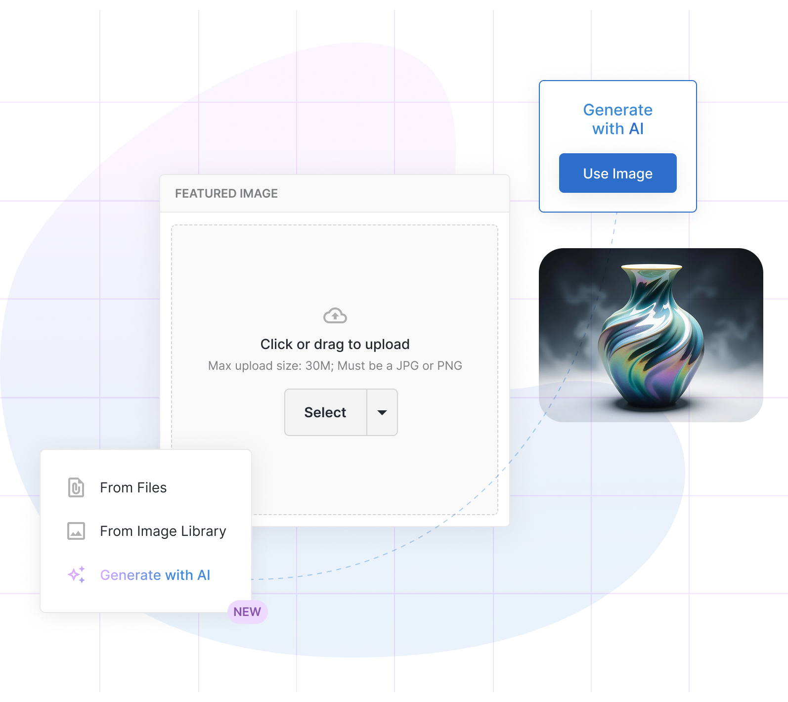
I framed the design around a micro-to-mega architecture: a minimal, non-intrusive entry point (a single menu item added to an existing dropdown) that opens into a fully-featured generation experience. This entry point was designed to work within modals, configure pages, and in-line editing for websites.
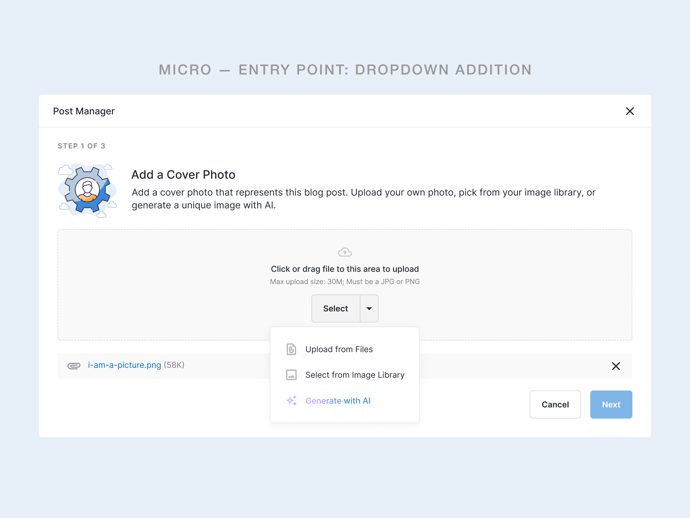
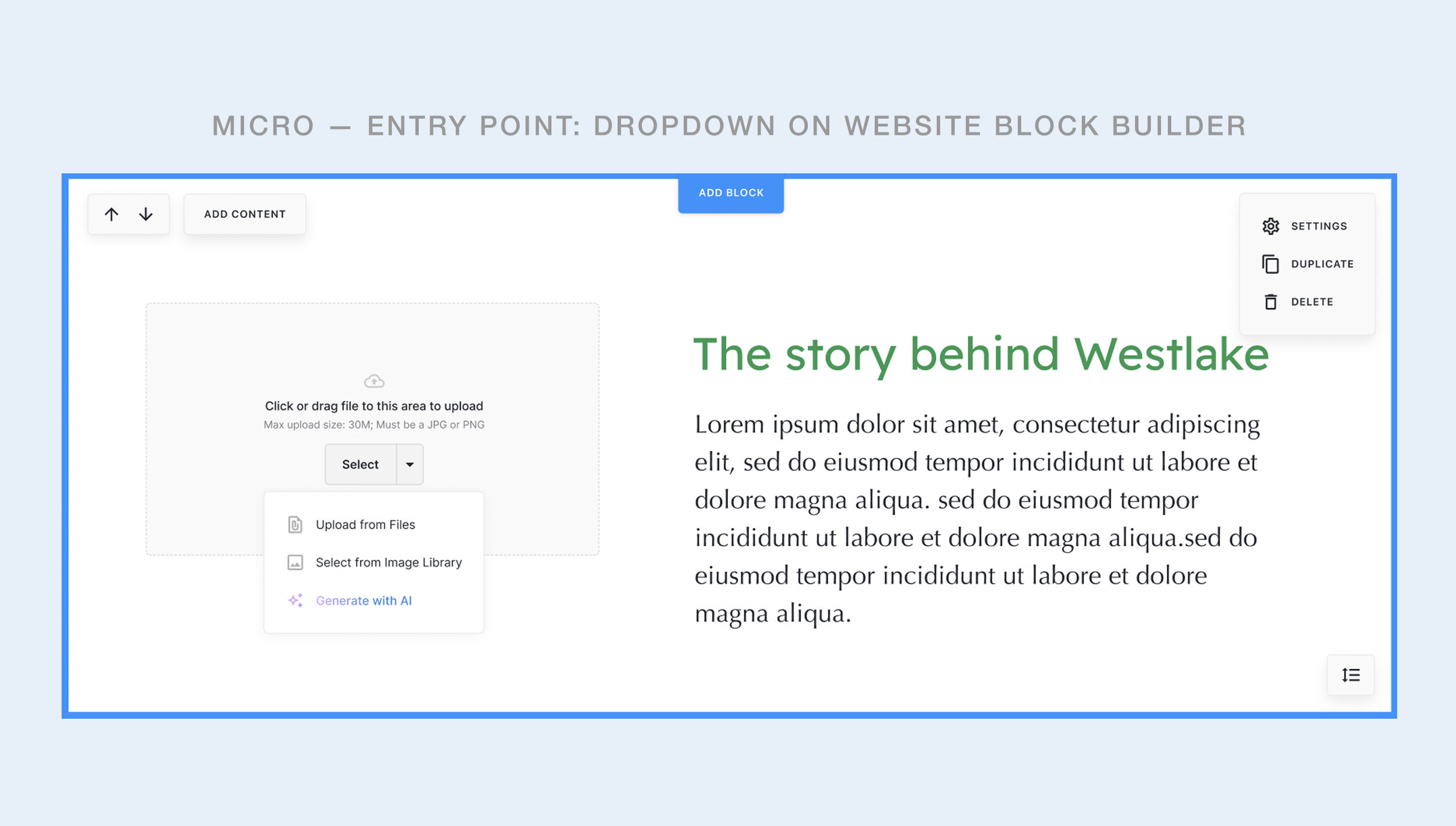
Adding "Generate with AI" as the third option in the existing dropdown was a deliberate choice. Users already knew where to go to set an image. They didn't need a new pattern — just a new option inside one they already used. The gradient signals novelty, promoting feature discoverability.
GENERATION EXPERIENCE
Describe it. See it. Use it.
The modal had one job: get the user from a vague idea to a usable image as fast as possible. That meant keeping the cognitive load extremely low. No style settings. No advanced parameters. No learning curve.
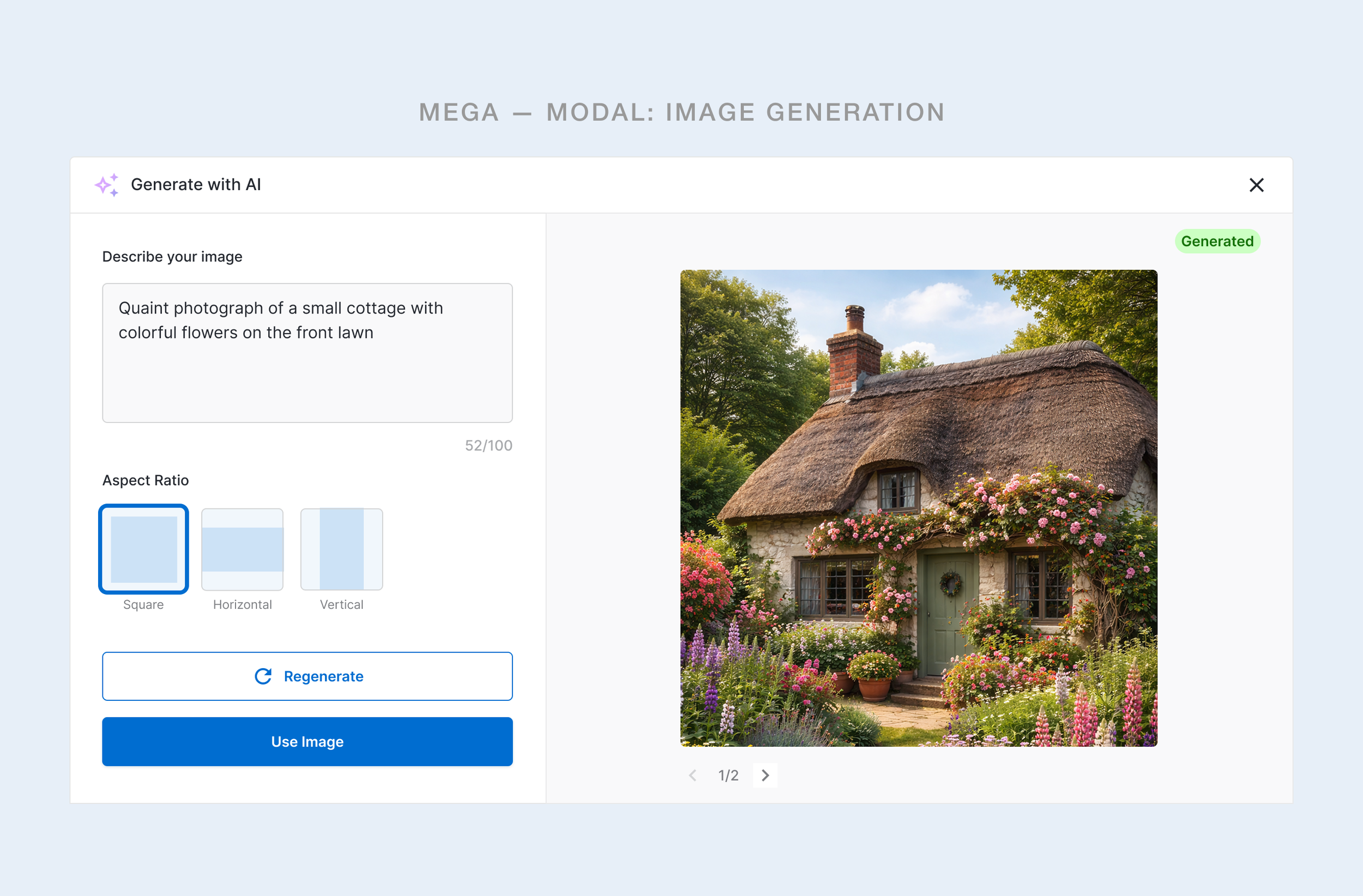
Key Design Decision
Pre-populating the prompt field with the content item title when the data was available (e.g. The title of the blog post the image was being generated for) was a small detail with a big payoff. It gave users a working starting point, immediately lowering the blank-canvas anxiety that AI tools often trigger, all while still inviting them to customize.
PROCESS
Move fast without breaking trust
This was a competitive rapid release, not a slow discovery project. The brief was clear: match what the stakeholders and the market expected, do it quickly, and integrate it in a way that didn't disrupt existing user behavior. That shaped every decision in the process.
01
Competitive audit
Reviewed Canva, Wix, and Squarespace AI image flows to identify the minimal viable feature set users now expected.
02
Interaction mapping
Mapped the existing image uploader interaction to identify the least-disruptive integration point for the new capability.
03
Concept design
Designed the dropdown entry point and modal in Figma, focusing on minimum viable inputs for a generative flow.
04
Internal user testing
Ran rapid internal sessions to validate discoverability of the new option and usability of the generation flow.
05
Iteration on findings
Prompt field seeding and aspect ratio UX based on session observations. Simplified the modal layout. Defined post-mvp scope.
06
Ship
Feature delivered to production. Designed for post-launch iteration as more real usage data began to surface patterns.
Internal user testing — rather than external research — was a deliberate choice given timeline pressure. It let us validate core usability quickly while maintaining the pace the business needed. The tradeoff was a smaller, less diverse sample; that's something we planned to address with post-launch observation.
What this rapid delivery effort taught our team about designing AI capabilities
Reflections
01
Context makes AI approachable
Pre-seeding the prompt with the content title was the small feature enhancement decision that made the blank input feel safe. Users generated better prompts when they had something to react to rather than starting from nothing.
02
Integration beats invention
The fastest path to adoption wasn't designing a new AI-first surface. It was embedding the capability into a pattern users already trusted. The dropdown didn't need explaining. "Generate with AI" was self-evident within a familiar context.
03
Regeneration is the real life-saving feature
Letting users regenerate without commitment, staying inside the modal, keeping their prompt, and allowing them to navigate to older iterations… All of this removed the stakes from every generation. It shifted the mindset from "Will I get it right?" to "Let me just try a few." That freedom to explore is what makes generative tools feel user-friendly.
04
Rapid doesn't mean reckless
Shipping fast under competitive pressure is a legitimate design constraint, not a quality compromise — as long as it's acknowledged honestly. We made clear tradeoffs (internal testing over external, minimal parameters over advanced controls) with a plan for what comes next.
OUTCOMES
Shipped. Competitive. Extensible.
PRODUCT:
Competition reached
AI image generation now available in the product alongside comparable offerings from Canva and Wix.
UX:
Zero-disruption integration
Existing users encountered no workflow changes. The new capability added to, rather than altered, the interaction they knew.
DESIGN:
Foundation for iteration
The modal architecture is scalable and was designed to accommodate upgrades without structural redesign.
KPIs & performance
By embedding AI generation directly into an existing workflow, the feature drove immediate adoption with zero onboarding friction. Users found it, used it, and came back to it. Mission accomplished.
ADOPTION RATE
within 14 days post-launch was
70%
BUSINESS IMPACT
Reduced stock image dependency by
65%
TIME SAVED
on image sourcing per session reduced
50%
USER SATISFACTION
of internal testers rated the UX intuitive