
AI-Powered Contact Details
— CASE STUDY: MARKETING 360 CRM
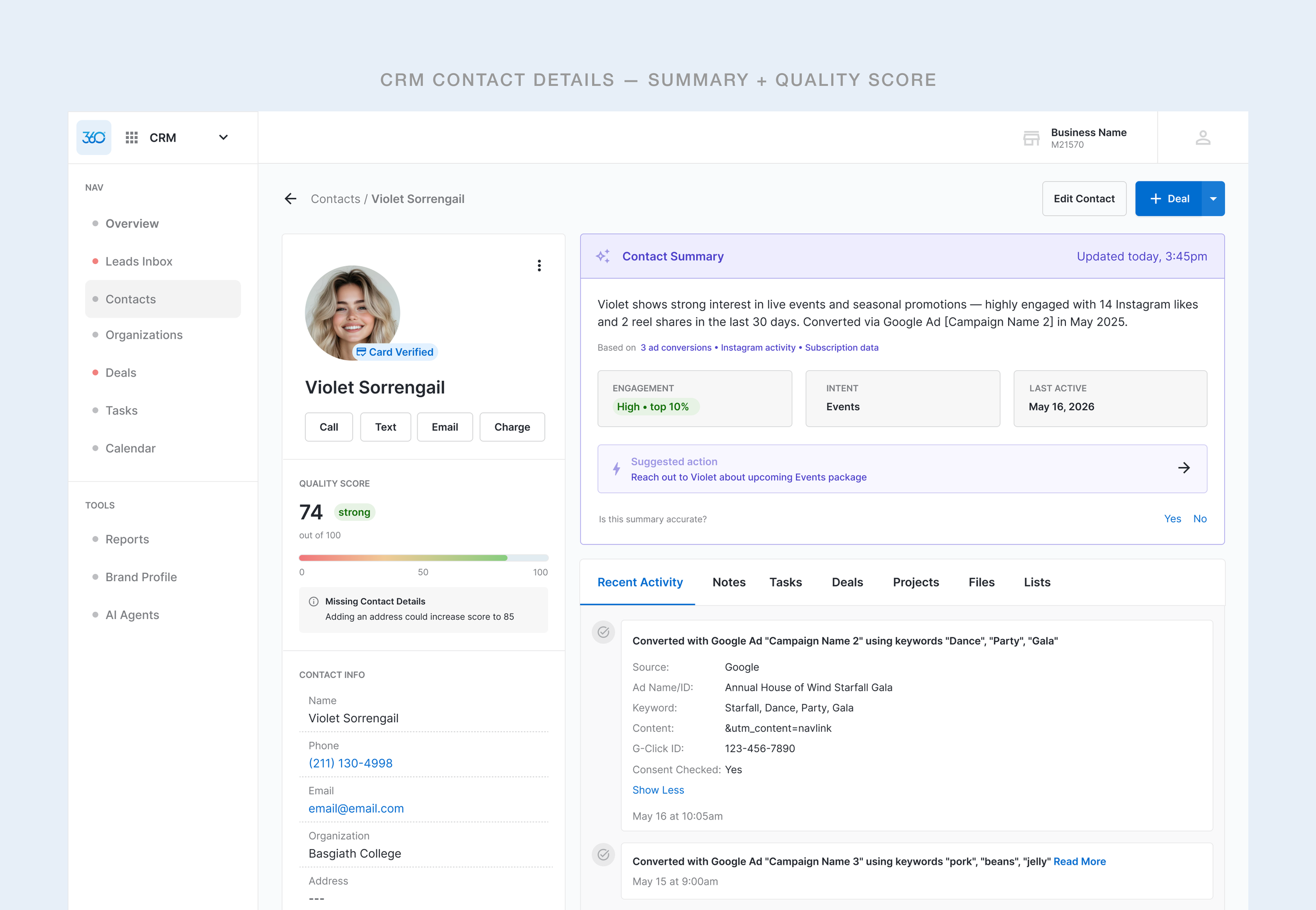
A redesigned contact detail experience for Marketing 360's CRM. Bringing behavioral signals, quality scoring, and suggested actions directly to a marketers and small business owners.
Role
Product Designer (Remote)
Feature
CRM and Contacts
Responsibilities
AI Component Design
Research
Platform
Responsive Web
Status
Live
Overview
One screen to rule them all.
Marketing 360's CRM original contact screen was functional but passive. Users could see a contact's basic info and scroll through a raw activity feed, but nothing connected the dots. Understanding a contact's intent, engagement level, or best next action to take to nurture the contact required manual interpretation of fragmented data across multiple screens within the platform.
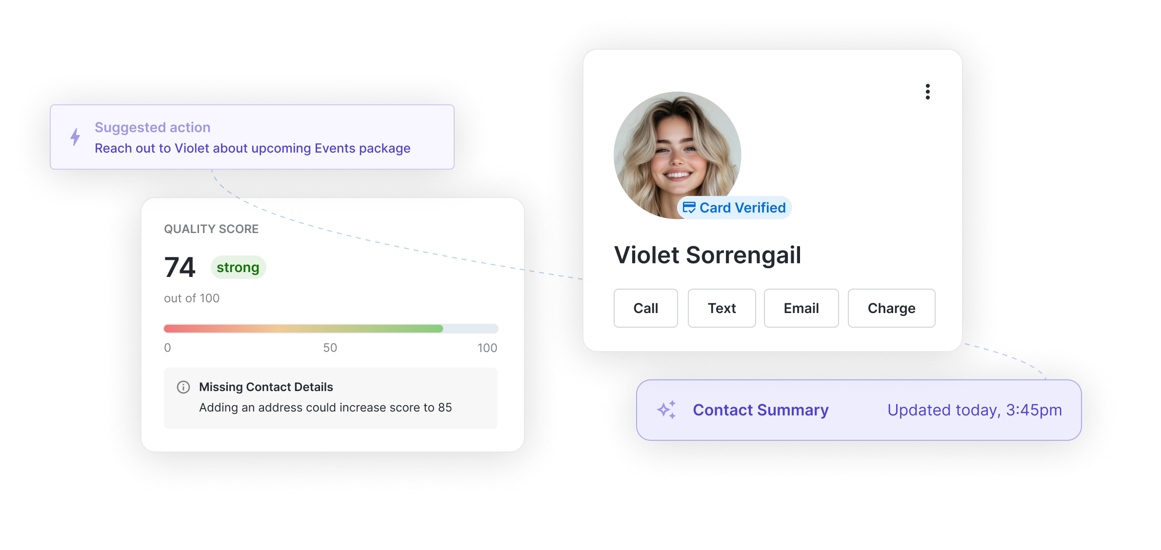
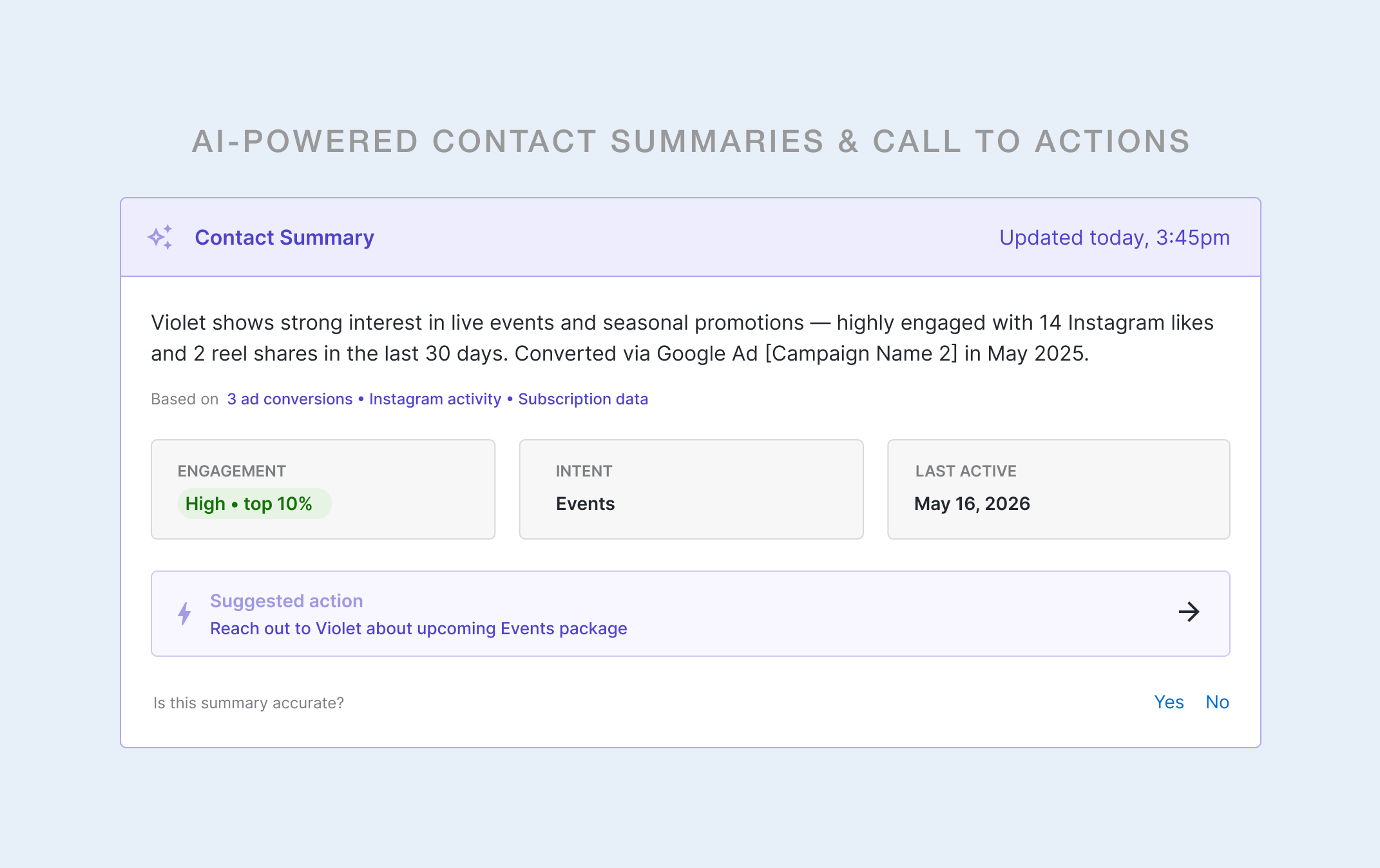
This project introduced an AI feature on top of the existing contact detail view which included a synthesized contact summary, behavioral signal chips, a quality score widget, UTM-sourced activity context, and a full contact action bar — all accessible without leaving the screen.
Design Constraints
The user should not have to navigate away from the contact details screen to investigate.
All intents and signals should be captured above the fold.
Goals
What we were solving for
01
Reduce cognitive load
Surface the most relevant behavioral context upfront; eliminate the need to scroll, cross-reference on other pages of the platform or manually interpret raw data.
03
Enable action without context-switching
Bring the most relevant behavioral context to the forefront; eliminate the need to scroll, cross-reference on other pages of the platform, or manually interpret raw data.
02
Establish a scalable UI
Define a UI language that clearly signals AI-generated content without overloading the interface, but can also extend across the entire Marketing 360 ecosystem.
04
Drive contact record completeness
Introduce a quality-scoring system that motivates reps to maintain richer contact data, which in turn improves the value of AI-generated insights over time.
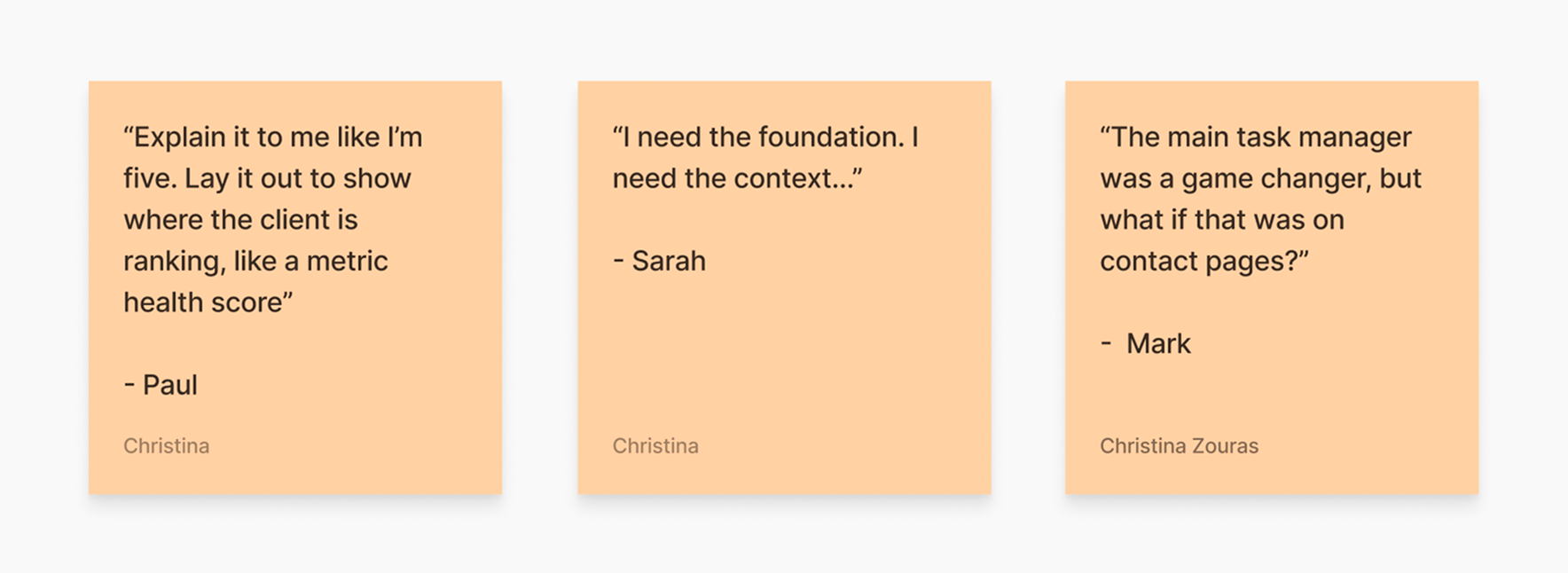
“I just need an easy button or quick insights I can digest to understand what it is I’m looking at where to go next.”
— RECURRING SENTIMENT WITH SMBs, VARIOUS USER INTERVIEWS
Approach
Give reps faster access to actionable steps
Leadership voiced wanting stronger CRM AI adoption to outlive competitors rising in the market that target mid- to small-business owners were considering instead. Our internal users needed clarity and needed to prioritize outreach, move deals forward, and increase revenue-driving activity. The design had to cater two both leadership’s terms and our internal users’ terms without creating a screen that felt like it was designed for the sake of having an AI feature.
User Problem
The info was there but it wasn’t clear to comprehend.
The existing contact screen gave reps raw inputs: a phone number, an email address, a chronological activity log. But the screen didn't answer the questions reps actually needed answered before picking up the phone: Is this lead warm or cold? What do they care about? When did they last engage? What should I do next?
Reps were doing that interpretive work manually, every time, on every contact. It slowed response time, introduced inconsistency, and buried the insight value already living inside the CRM's own data.
Research & Data
The qualitative research became too obvious to ignore
Repetitive sentiments in moderated user interviews don’t lie, and neither do bounce rates and cancellations. These were just some of the many findings our UX team gathered during both past and present discovery research sessions on the CRM app. There was a real need for clarifying features and we leaned on our synthesized findings to scope out the requirements.
Design Approach
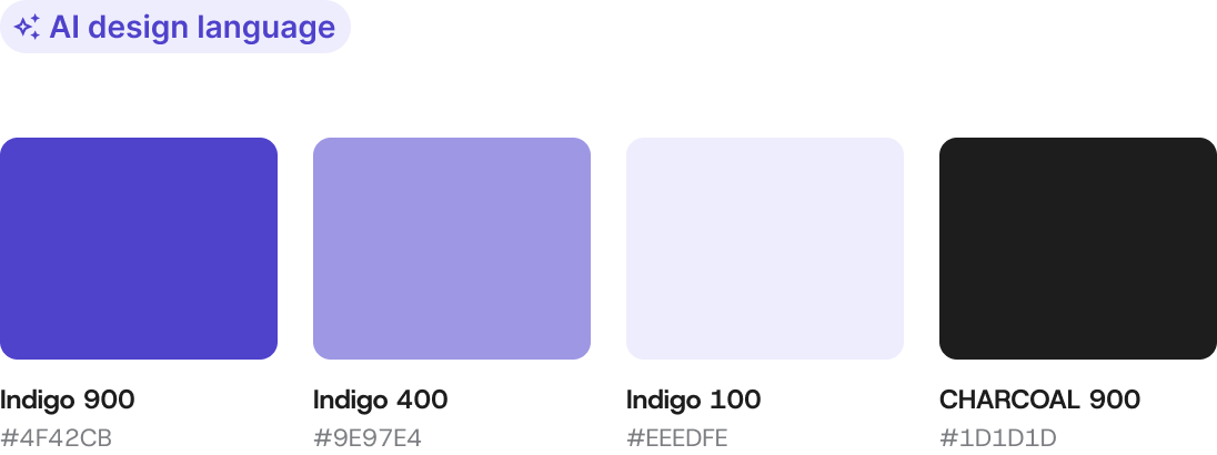
Building the AI design language first
Before designing a single component, I made a foundational decision: AI-generated content needed its own clear visual code within the CRM. Without it, reps wouldn't know what to trust, what was live data, and what the system synthesized on their behalf.
Purple became the designated AI signal color. It was applied consistently across the summary banner, the sparkle icon, timestamp, and suggested action elements. This created an immediate, scannable distinction between AI-driven surfaces and static UI — a pattern the engineering team could scale as new AI features were added.
Outcomes
Approved. Shipped. Instantly adopted.
The final scope of what we delivered:
AI Contact Summary
Suggested action bars
Quality score widget
Data provenance tags
BEHAVIORAL SHIFTS
Summary over scrolling
Users began using the AI summary as their primary contact context source rather than manually parsing the activity feed.
EFFICIENCY
Reduced time on page
Time spent orienting to a contact before taking action decreased. Users took action more successfully with the provided context.
RECEPTION
Positive Feedback
Internal feedback and NPS responses reflected improved satisfaction with the CRM’s contacts experience
Reflections
What this project reinforced
01
AI features need a designated visual language
Treating AI UX as a one-off component misses the point and isn’t ideal for scaling. Defining a reusable system for colors, icons, timestamp patterns… it’s setting up the work early so future features to inherit
02
Insight hierarchy matters more than feature completeness
The most useful version of this feature wasn't the most information-dense one with a large chunk of copy under the summary. It was the version that lead with clear actions that users could take. AI should feel like a co-pilot rather than a report on these screens.
03
Building trust through transparency, not perfection
The AI summary and quality scores aren’t supposed to be perfectly high scores — and that’s okay. They signal to the user that their CRM is designed to improve over time.