— CASE STUDY: MARKETING 360 DESIGN SYSTEM
Building a Scalable Design System
Marketing 360’s CRM-focused design system that unified a suite of apps within a larger platform/ecosystem, brought on visual cohesion, eliminated discrepancies, and accelerated delivery.
Design System Atomic Design Collaboration Team Leadership UI Design
Role
Product Designer (Remote)
Platform
Web App
Responsibilities
UI Design
Documentation
User Testing
Timeline
Q1 + Q2 2020
Framework
Figma Library
React
Who is Marketing 360?
Solving design for SMB users
Marketing 360 is a SaaS CRM platform that enables SMBs to manage and scale operations from a unified system. It consolidates core workflows such as websites, payments, lead management, scheduling, reputation monitoring, and marketing, all into a single platform and source of truth for customer data.
The Goal
Curate, centralize, document and design a cohesive intuitive scalable design system in Figma that aligns the sporadic UI components we’ve shipped across the platform before the UX team became an established practice at the organization. Our bottleneck was mismanaged components across different design tools and we knew a design system would solve descrepancies, accelerate projects, smooth the design to engineer hand off, and prevent rework or accidental duplication.
The Process
Starting a design system is less about building components from scratch and more about aligning what has already been shipped and what is ready to be shipped in the future. We audited our designs and the production environement before we redefined a visual language that aligned with Marketing 360’s brand voice, culture, and its audience of over 10,000 small business owners. This helped us strengthen the stray components we had already designed furthur centralized our process by migrating legacy components built on other platforms such as Adobe XD and Sketch.
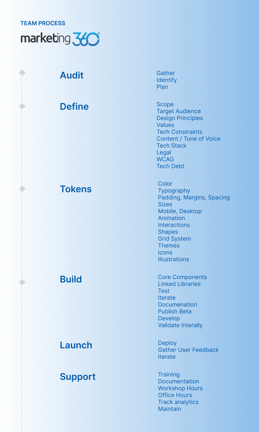
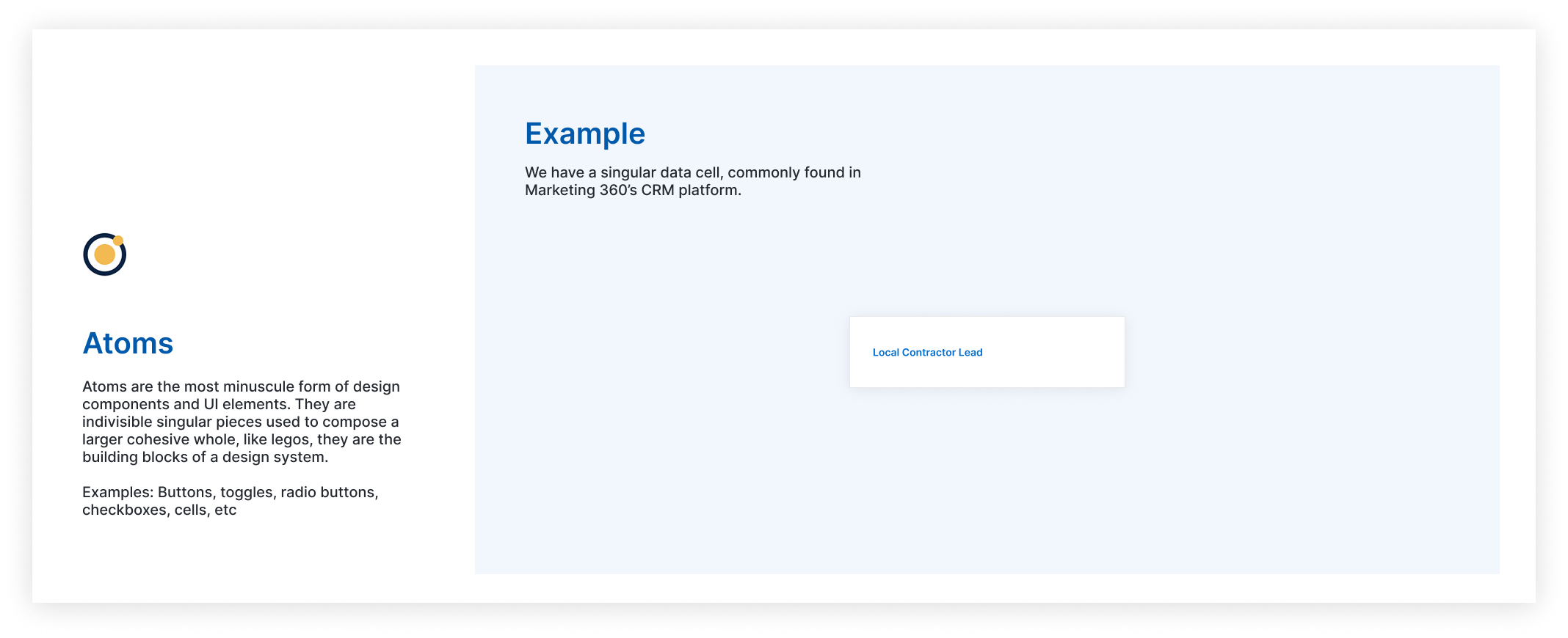
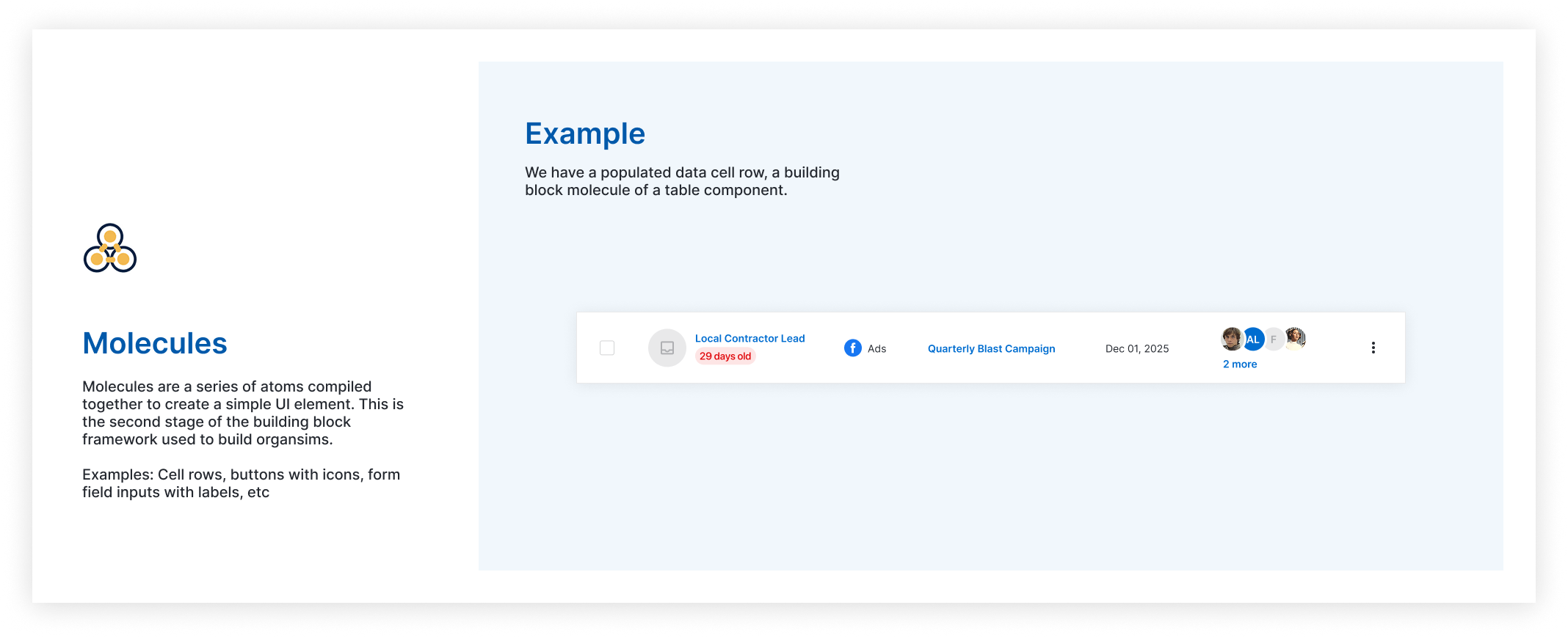
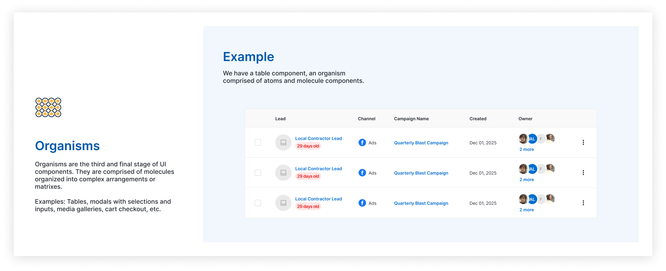
Atomic Design Principles
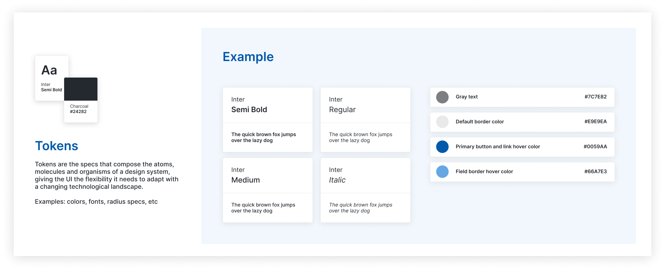
We based our design system’s structure off Brad Frost’s Atomic Design methodology. We stayed true to the atoms, molecules, and organisms system while adding our own adaptation to better suit our system’s needs: tokens. Tokens, while not an aspect of the Atomic Design methodology, gave us the creative freedom to identify interchangeable aspects of our components and document them accordingly.
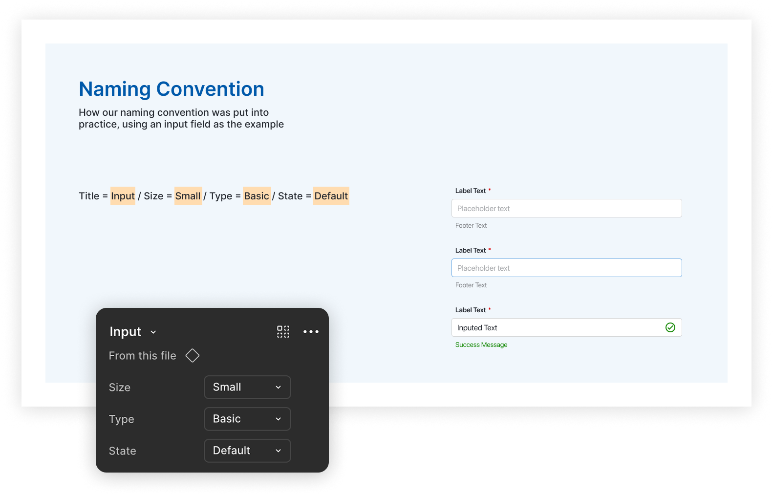
A Design System that’s easy to adopt
As our UI library expanded, we defined a naming convention for all the different interaction variants. This became useful when it was time for our team to handoff our design system to developers.
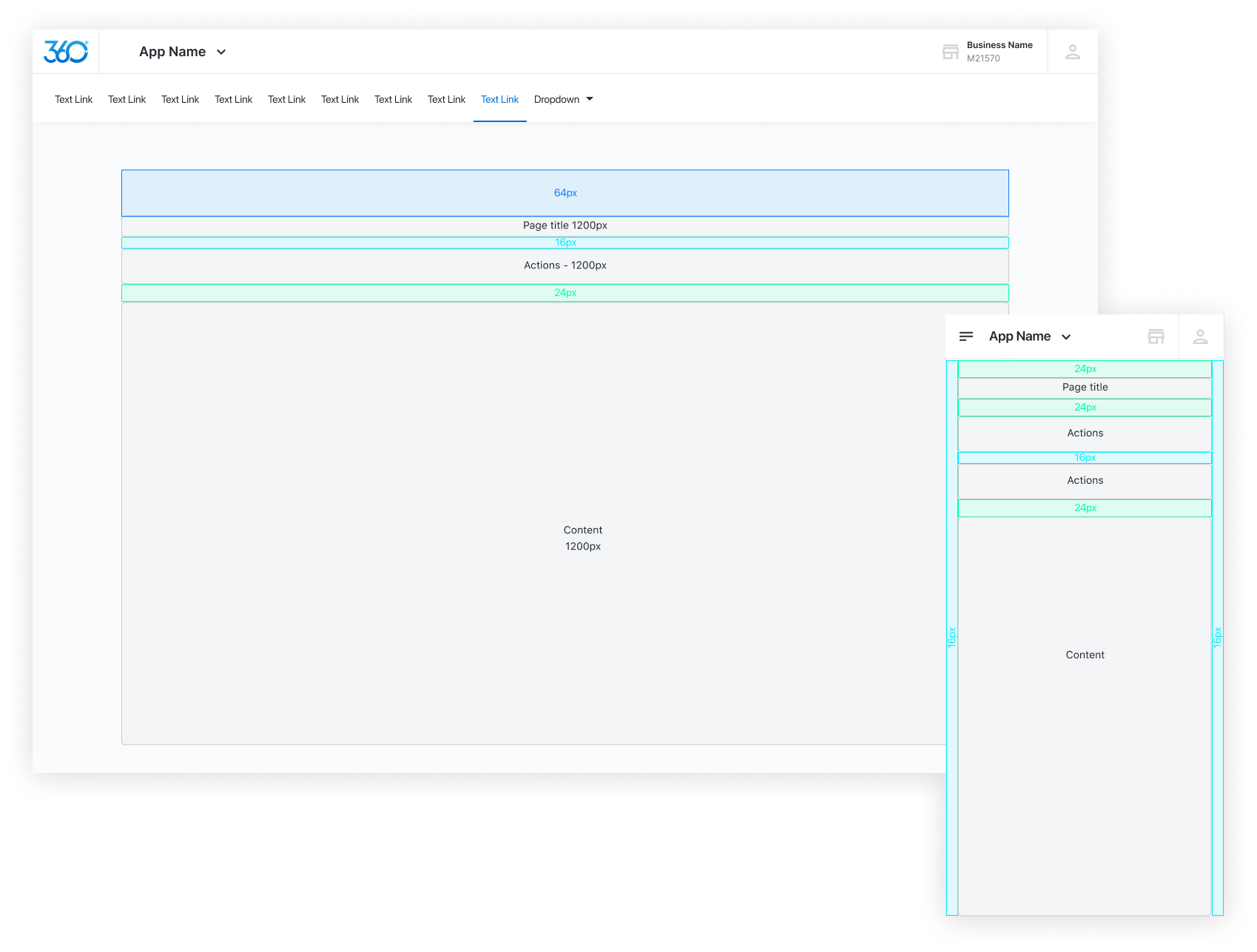
Specifying pages, templates, and layouts
We began to see the same patterns crop up in different places of the platform, so we audited all our templates in a workshop, compiled an official archive of page templates and layouts within our Figma Library as a source of truth to fall back on. We provided grid guidelines to ensure layout consistency across projects. The specifications alone reduced design team layout and padding inconsistencies by up to 20% and a 50% increase in workflow execution.
KPIs & performance
The design system was more than just a UI kit for the team. It was the main driver of success, velocity, consistency, and operational efficiency across our product team.
ADOPTION
of components used post-launch
75%
TEAM-WIDE VELOCITY
increased by
80%
DESIGN WORKFLOW
delivery increased by
50%
REDUCING ERRORS
and discrepancies by
65%
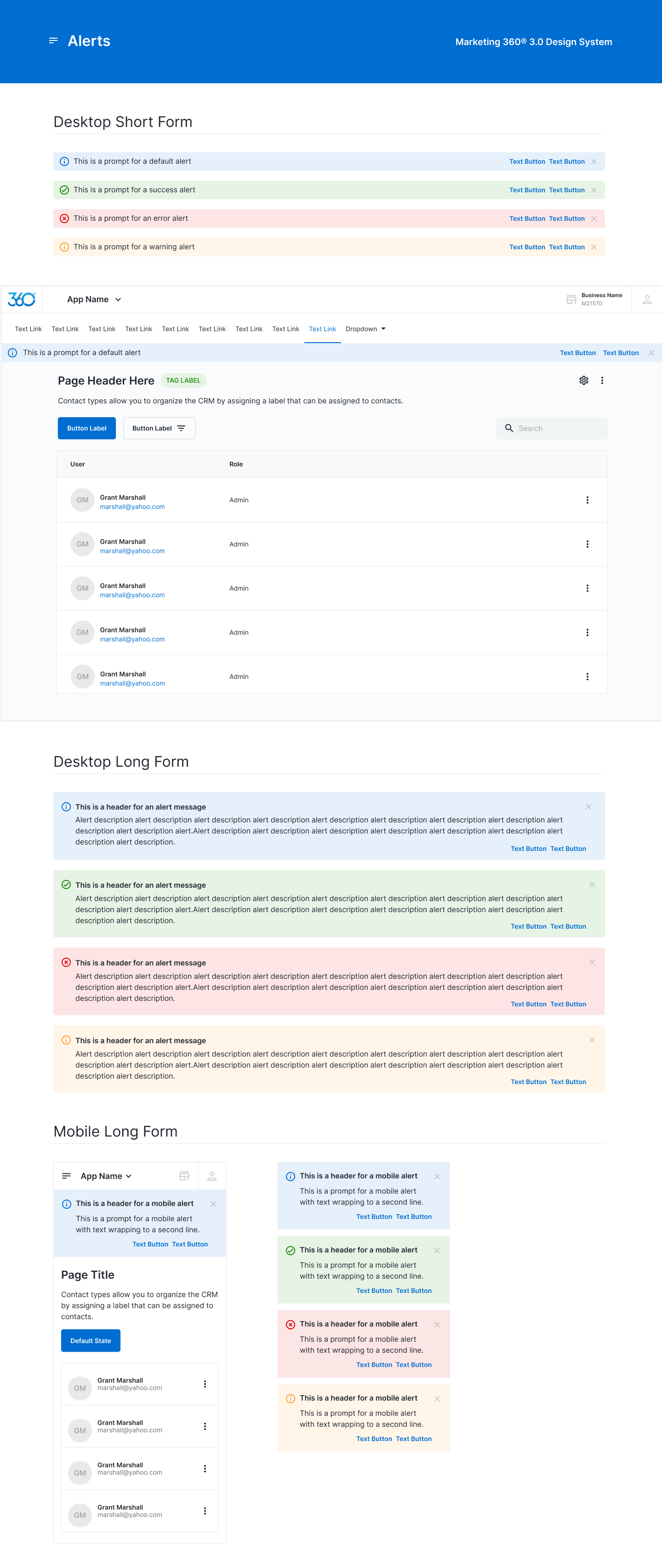
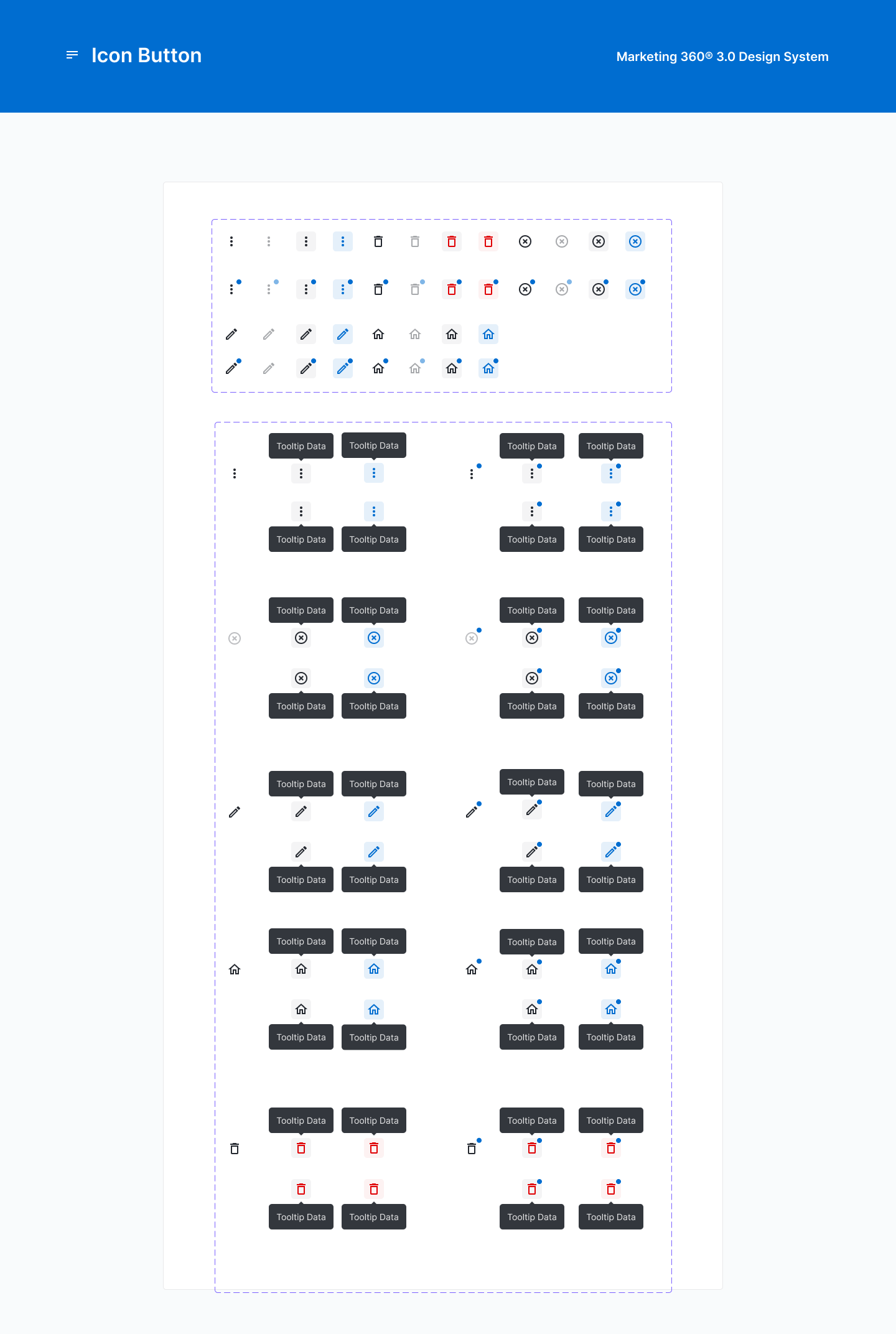
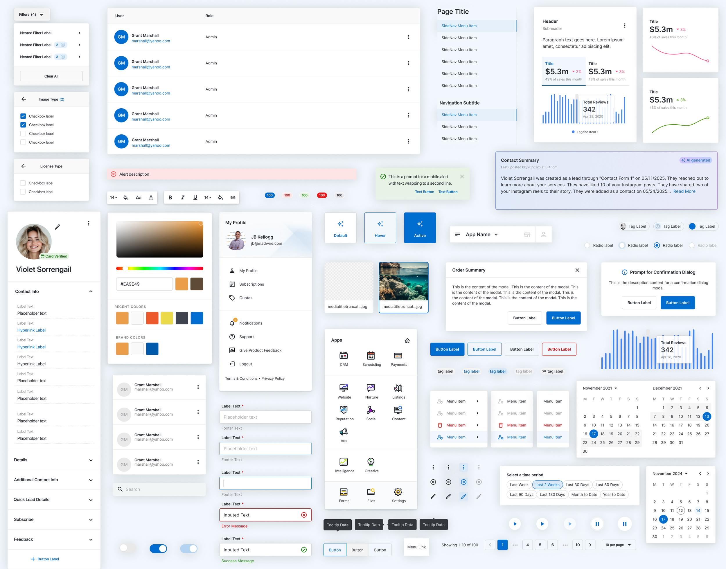
Showcasing the design system
Below are just some of the many token values, UI components and patterns belonging to the Marketing 360 design system: